Decorating a small space presents a unique challenge: how to make it feel personal and vibrant without making it feel cluttered. Flowering houseplants are a perfect solution, bringing life, color, and a touch of nature indoors. But simply collecting random plants can quickly lead to a chaotic look. The secret to creating a beautiful, intentional display lies in understanding a little bit about color. By applying some basic color principles, you can transform your collection of plants into a cohesive design element that enhances your home.
My name is Kamil Khan, and for years, my passion has been centered on the world of indoor flowers. This journey hasn’t been about formal horticulture degrees, but about hands-on experience, countless hours of observation, and a genuine curiosity for how these plants live and breathe within our homes. I’ve learned which plants thrive on a crowded city windowsill and which ones prefer the filtered light of a bookshelf. This experience has taught me that the joy of houseplants goes beyond just keeping them alive; it’s about how we use them to create spaces that feel like our own. My goal is to share what I’ve discovered, helping you bring intentional beauty into your home, no matter how small.
Understanding Basic Color Theory for Plant Selection
You don’t need to be an artist to use color effectively. The most helpful tool is the color wheel, which simply organizes colors in a logical way. Thinking about this wheel when you choose your next flowering houseplant can make all the difference. It helps you see the relationships between colors, which is the key to creating combinations that just work.
The Core Concepts: Hue, Tint, Tone, and Shade
These terms might sound technical, but they are easy to grasp when you think about plants. They help describe the variations within a single color family, which is useful for creating sophisticated looks.
- Hue: This is just another word for a pure color—the basic red, yellow, or blue you see on a color wheel. Think of the bold, pure red of an Anthurium flower.
- Tint: A tint is a hue with white added. This lightens the color, making it paler. The soft, baby-pink flowers of some Kalanchoe varieties are a perfect example of a tint.
- Tone: A tone is a hue with grey added. This makes the color more subtle and muted. Many Cyclamen flowers have a dusty, toned-down purple or pink that feels very elegant.
- Shade: A shade is a hue with black added. This darkens the color, making it richer and deeper. The almost-black, deep burgundy petals of some orchids are a classic example of a shade.
Understanding these variations allows you to create a monochromatic look with just one color, using plants that display different tints, tones, and shades of it for a layered, professional effect.
Warm vs. Cool Colors and Their Impact on Space
Colors have a psychological effect on how we perceive a room. In a small space, this can be a powerful tool.
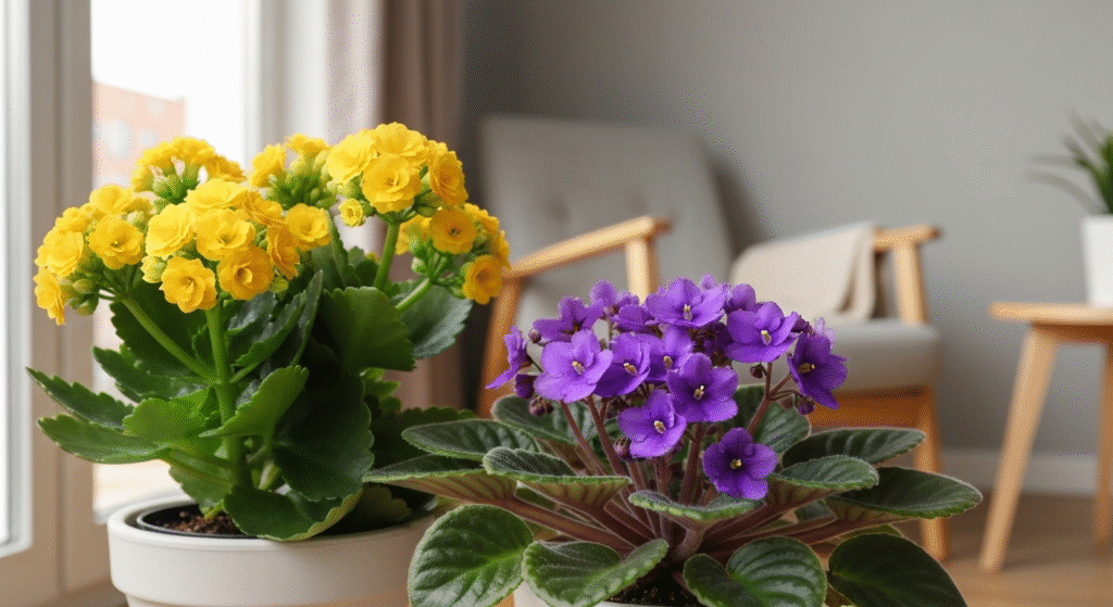
- Warm Colors (Reds, Oranges, Yellows): These colors are energetic and attention-grabbing. They tend to advance, or feel closer than they are. This can make a room feel cozier and more inviting. However, using too many can sometimes make a small space feel even smaller. A single, vibrant yellow Begonia on a desk can add a pop of cheerful energy.
- Cool Colors (Blues, Purples, Greens): These colors are calming and serene. They tend to recede, or feel farther away. This can help create a sense of depth and make a small room feel more open and spacious. A group of African Violets with their cool purple blooms can bring a sense of tranquility to a corner.
Here’s a quick breakdown of how these color groups can affect the mood of your space.
| Color Group | Psychological Effect | Best Use in Small Spaces |
| Warm Colors | Energizing, Cozy, Inviting | As accent points to add a pop of color and draw the eye. |
| Cool Colors | Calming, Serene, Spacious | As the dominant theme to make a space feel larger and more relaxed. |
Creating Cohesive Looks with Color Schemes
Once you understand the basics, you can start combining colors intentionally. Color schemes are simply proven formulas for pairing colors in a way that is pleasing to the eye. For houseplants, these schemes provide a great roadmap.
Complementary Color Schemes: The Power of Opposites
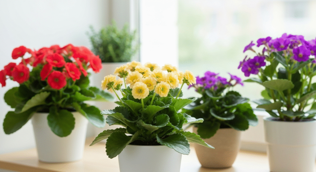
A complementary scheme uses two colors that are directly opposite each other on the color wheel. This creates the highest possible contrast, making both colors appear brighter and more intense. It’s a bold choice that really makes a statement.
In the plant world, a classic example is pairing purple and yellow. You could place a pot of bright yellow Kalanchoes next to a deep purple Gloxinia. The contrast is dramatic and full of energy. Another powerful combination is red and green. Since most plants already provide the green, any red-flowering plant like an Anthurium or a Christmas Cactus will naturally create this high-contrast look.
| Plant Pairing Example | Colors | Effect |
| African Violet & Yellow Begonia | Purple & Yellow | Energetic, vibrant, and eye-catching. |
| Red Anthurium & Green Foliage Plant | Red & Green | Classic high-contrast that makes the red flowers pop. |
| Blue Orchid & Orange Kalanchoe | Blue & Orange | A bold and dynamic pairing that feels modern. |
Pros and Cons of a Complementary Scheme
- Pros:
- Creates a vibrant, high-energy look.
- Makes colors appear more intense.
- Excellent for creating a strong focal point.
- Cons:
- Can feel overwhelming in a small space if not used carefully.
- Requires careful balance to avoid looking chaotic.
Analogous Color Schemes: Harmonious Neighbors
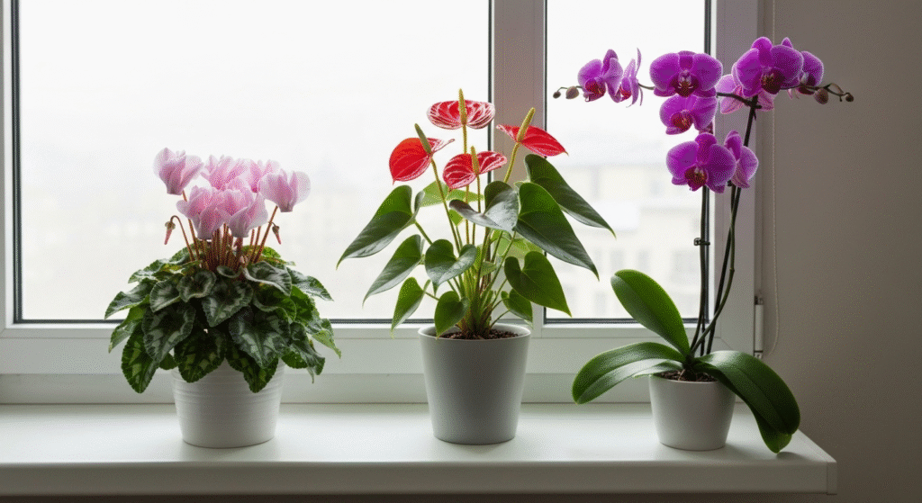
An analogous scheme uses colors that are next to each other on the color wheel. Think red, orange, and yellow, or blue, purple, and pink. This approach creates a very different feel from a complementary scheme. It’s much lower in contrast, resulting in a serene, comfortable, and harmonious look.
This is one of the easiest schemes to create with flowering houseplants. For example, you could group a red Anthurium, a pink Christmas Cactus, and a deep magenta Phalaenopsis Orchid. Because the colors are closely related, the arrangement feels unified and calm. It’s an excellent strategy for a bedroom or any space where you want to create a relaxing atmosphere. I’ve often used this in my own living room to create a peaceful corner, combining different shades of pink and purple that flow into one another.
| Plant Grouping Example | Colors | Effect |
| Pink Cyclamen, Red Anthurium, Magenta Orchid | Pink-Red-Magenta | A warm and cohesive look that feels very unified. |
| Peace Lily, Yellow Kalanchoe, Light Green Foliage | White-Yellow-Green | A fresh, bright, and cheerful combination. |
Pros and Cons of an Analogous Scheme
- Pros:
- Creates a peaceful, serene, and harmonious feeling.
- Very easy for beginners to get right.
- Gives a display a coordinated, designer look.
- Cons:
- Can sometimes lack the “wow” factor of a high-contrast scheme.
- It’s important to vary plant shapes and textures to keep it interesting.
Monochromatic Schemes: Sophistication in a Single Hue
A monochromatic scheme uses only one color (hue) but incorporates its different tints, tones, and shades. For example, a display of all-white flowering plants—like a Peace Lily, a white Orchid, and a white Amaryllis—is a classic monochromatic scheme. It’s incredibly chic and sophisticated.
This scheme is perfect for small spaces because its simplicity prevents it from looking cluttered. You could create a beautiful display using only pink-flowering plants: a pale pink African Violet, a vibrant fuchsia Christmas Cactus, and a dusty rose Cyclamen. Even though it’s all one color family, the variation in lightness and intensity provides plenty of visual interest. This approach forces you to pay more attention to the shape, texture, and form of each plant, which adds another layer of design.
Pros and Cons of a Monochromatic Scheme
- Pros:
- Looks elegant, sophisticated, and intentional.
- Very calming and easy on the eyes.
- Impossible to clash colors.
- Cons:
- Can be challenging to find several different plants in the exact same hue.
- Relies heavily on variations in texture and form to avoid looking flat.
Smart Plant Pairings for Impact in Tight Quarters
Beyond the basic color schemes, how you pair individual plants makes a huge difference, especially when every inch counts.
Pairing by Flower Color and Foliage
Never underestimate the power of leaves! The foliage is the constant backdrop for your flowers. The color and shape of the leaves can dramatically change the look of your display.
- Dark Green Foliage: Leaves that are a deep, solid green make bright flower colors pop. From my own experience, placing a vibrant red Amaryllis in front of a Snake Plant with its dark green, almost-black leaves made the red blooms look incredibly rich and jewel-toned.
- Variegated Foliage: Leaves with patterns of white, cream, yellow, or pink add another layer of visual interest. A variegated Pothos or Hoya can break up solid blocks of color and add texture to an arrangement, even when nothing is in bloom.
- Light Green or Yellow-Green Foliage: Bright, chartreuse leaves can make a whole arrangement feel fresh and zesty. Pairing them with white or yellow flowers creates a bright and cheerful analogous look.
Considering Pot Color in Your Scheme
The container your plant lives in is a critical part of the overall design. The color of the pot can either support your scheme or disrupt it.
- Neutral Pots (Terracotta, White, Grey, Black): These are the safest and often most effective choice. Neutral pots allow the colors of the plants—both flowers and foliage—to be the star of the show. They create a clean, consistent look that works with any color scheme.
- Colored Pots: You can use the pot itself as a color element. For a complementary scheme, you could put a yellow-flowering plant in a purple pot. For an analogous scheme, a pink-flowering plant could go in a red pot. This is a great way to reinforce your chosen color combination.
| Pot Strategy | Effect | Best For |
| Neutral Pots | Lets the plant’s colors shine. Creates a clean, uniform look. | Any scheme, but especially effective for complex or multi-colored plant groupings. |
| Matching Pots | Reinforces the color of the flower for a monochromatic look. | Monochromatic schemes (e.g., a white pot for a white orchid). |
| Contrasting Pots | Adds another layer of high contrast to the display. | Complementary schemes (e.g., a blue pot for an orange kalanchoe). |
How to Avoid Visual Clutter in a Small Space
The biggest fear when decorating a small space is making it look messy. With plants, it’s easy to cross the line from a lush oasis to an overgrown jungle. Here are a few design principles to keep your display looking curated.
The Rule of Three: Grouping for Success
In design, things arranged in odd numbers—especially groups of three—tend to look more natural and appealing than things in even numbers. Instead of lining up four small plants on a windowsill, try grouping three together.
Within your group of three, aim for variety. Choose plants of different heights, textures, and shapes. For instance, you could pair a tall, elegant Peace Lily with a low, mounding African Violet and a trailing Hoya. This variation creates a dynamic and interesting visual that draws the eye in.
Using a “Hero” Plant
A great strategy for any small display is to select one “hero” plant. This should be your largest, most dramatic, or most colorful flowering plant. This plant becomes the focal point of the arrangement. You can then surround it with a few smaller, more subtle plants that support it without competing for attention. For example, a stunning, large blooming Orchid could be your hero, supported by smaller green ferns or a simple ivy whose foliage complements the orchid’s blooms.
The Importance of Negative Space
This might be the most important rule for small spaces. Negative space is simply the empty space around your objects. You don’t need to fill every single surface with a plant. Leaving some breathing room around your plant groupings allows them to be seen and appreciated properly. It prevents the display from feeling heavy and cluttered. I learned this the hard way after cramming a dozen plants onto one small bookshelf. When I removed half of them and arranged the rest into two distinct groups, the entire setup looked more intentional and felt much lighter.
Frequently Asked Questions
What’s the easiest color scheme for a beginner to try?
An analogous color scheme is the most forgiving and easiest to start with. Simply choose two or three flowering plants with colors that are next to each other on the color wheel, like pink, purple, and blue. It’s almost impossible to make it look bad, and it always results in a harmonious display.
Can I mix flowering plants with non-flowering ones in a color scheme?
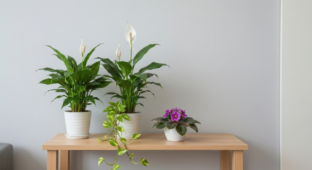
Absolutely! In fact, you should. Non-flowering plants (or foliage plants) provide the essential green that makes other colors pop. You can also use the foliage color itself as part of your scheme—for example, pairing the silvery leaves of a Scindapsus pictus with the cool purple flowers of an African Violet.
How do I choose colors that make my room look bigger?
To create a sense of spaciousness, stick with cool colors. Plants with blue, purple, or pure white flowers, paired with deep green foliage, will tend to recede visually, making the walls feel a bit farther away.
Do I need to buy all new pots to match my color schemes?
Not at all. One of the most affordable ways to create a cohesive look is to unify your pots. You can buy a few simple terracotta or white pots, or even use spray paint to give your existing collection of mismatched pots a uniform color. This simple trick can instantly make your plant display look more organized.
Conclusion
Bringing flowering houseplants into a small home is about more than just adding greenery; it’s an act of decoration. By moving beyond random selection and embracing the simple principles of color, you can elevate your plants into true design features. Whether you choose the bold contrast of a complementary scheme, the gentle harmony of an analogous one, or the chic simplicity of a monochromatic look, being intentional with color is the key. Remember to consider your foliage and pots as part of the bigger picture, and don’t be afraid to leave some empty space. Your small space doesn’t have to limit your style—in fact, it can be the perfect canvas for creating a beautiful, colorful, and personal indoor garden.